Graphed Examples of Genotype-Environment Interactions
Remember from the Genotype-Environment Interactions post that you need at least two genotypes and at least two environments to show a genotype-environment interaction.
It’s a lot easier to visualise these interactions with graphs, so here goes!
“Environment” on the x-axis could refer to temperate vs tropical, low altitude vs high, or any other variable a breed is exposed to.
“Peformance” on the y-axis could refer to such things as length of wool, rate of growth, milk production, or any other measurement of animal performance.
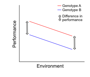
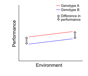
The two graphs below both show no interaction, as both lines in each are parallel. The orientation or slope of the two lines may differ from graph to graph: the key distinction is that the lines are parallel.
© Optimate Group Pty Ltd
© Optimate Group Pty Ltd
If the lines are parallel, then they are an equal distance apart. Thus there is no change in performance difference between each genotype in each environment. The performance itself may differ for each genotype in different environments—as evidenced by a slope upwards or downwards on the graph— but the difference in performance between the genotypes remains the same.
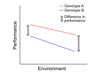
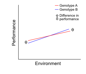
The two graphs below show a weak interaction. There is a small change in performance difference. In the second graph, the lines cross—this indicates a reranking of genotype when environment changes.
© Optimate Group Pty Ltd
© Optimate Group Pty Ltd
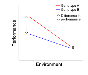
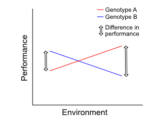
The two graphs below show a strong interaction. The difference in performance between the two genotypes is quite large. Again we can see a reranking of genotype in the second graph.
© Optimate Group Pty Ltd
© Optimate Group Pty Ltd
The next post will cover some real-life examples of G × E interactions in animals.
Leave a comment